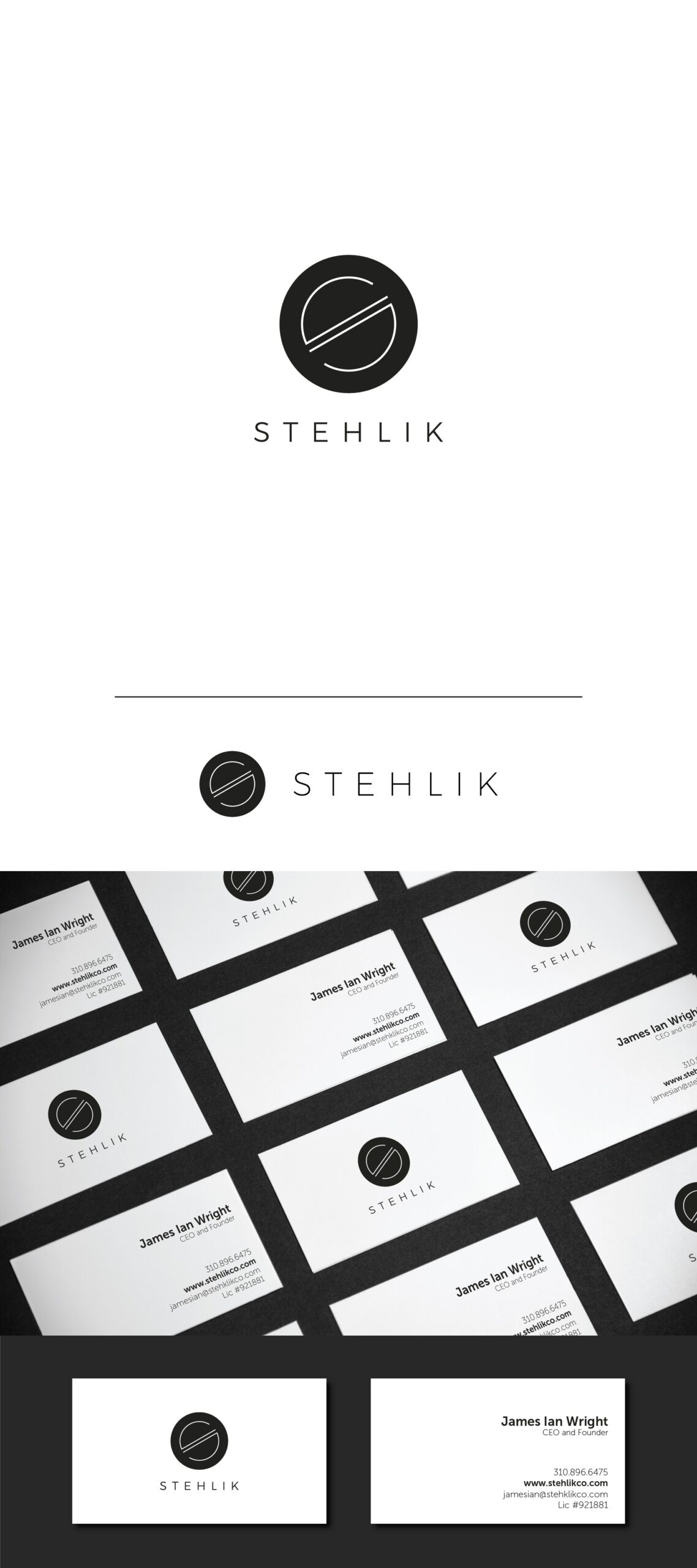
My logo concept is clean and minimal form of letter S with strong diagonal across the circle shape.
I was inspired by examples that client have provided and I really like elegance and architectonic simplicity of thin lines on black surface. It says a lot about hi end construction.
Circular form tend to project a positive emotional message. Diagonal form cultivates a dynamic and energetic feel around brand. Also, diagonal rising to the right top of composition has a good relation with progress and development.
I used simple and minimal, extra light typography to follow up the sophisticated thin/bold concept.