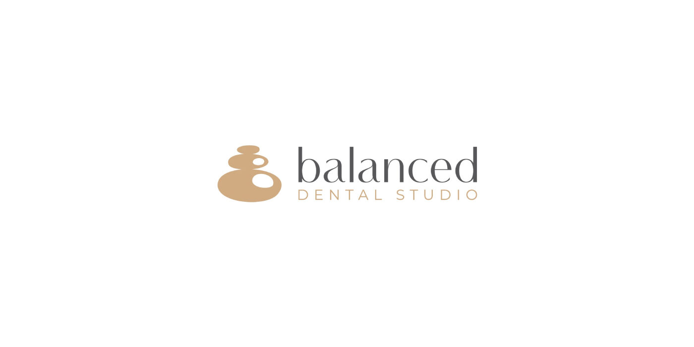
The core concept of the logo revolves around the idea of balance and harmony, which are central to brand’s philosophy. To visually represent this, I have incorporated three balancing stones with a subtle reflection forming the initial letter “B” for Balanced.


