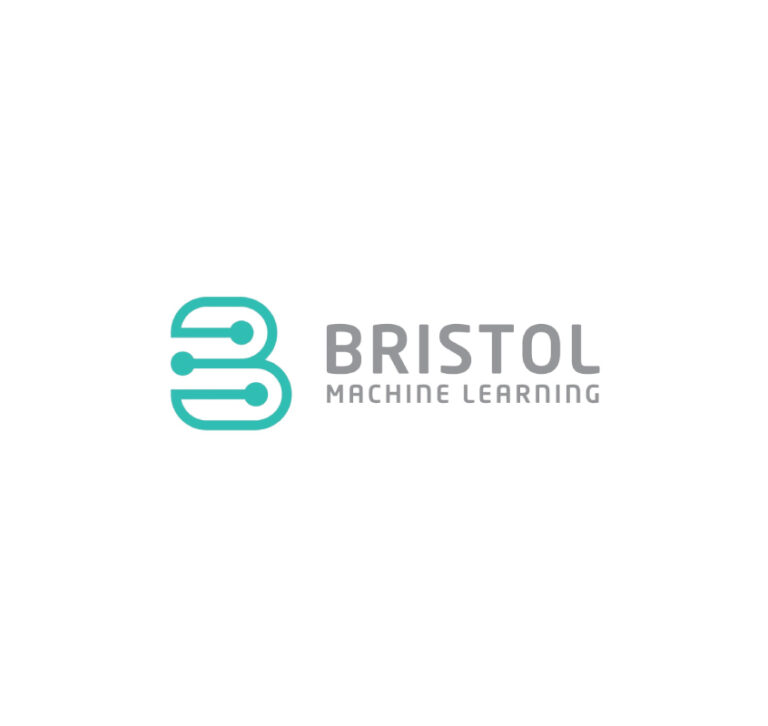
Logo for Coffee Roasters
The meaning of “gus” in arabic the bow – I combined the bow and coffee bean.
Awesome brand identities
Emotionally evocative logos crafted with meticulous attention to detail. Each design tells a vibrant story, blending psychology and art to resonate with audiences, capturing the essence of every brand.
The meaning of “gus” in arabic the bow – I combined the bow and coffee bean.
The concept is an abstract and simple logo mark inspired by the number 7 and a graph. The clean and minimal form of the connected dots develops a sense of problem solving around the brand. For the main typography, I used a sharp lowercase font, because lowercase letters are often used by companies that want …
Embodying luxury, transformation, dynamism, and enlightened spirituality through the expanding rays. It strikes a powerful yet playful balance, suitable and legible across various display sizes. The Möbius strip form symbolizes wholeness and continuity, speaking to the unity of trinity.
An abstract logo mark inspired by the initial letter C and dynamic forms of comet tail and dragon wings. It communicates rebellion and power of self-reliant mindset.
My concept is an elegant and iconic logo mark inspired by medical cross, capsule and exclamation mark.Although our theme is about danger of drug abuse, the brand identity must evoke hope and optimism. Circular and oval forms ted to project positive emotional message. Sophisticated and medical related turquoise color is friendly and happy color enjoying …
Two walking sticks as a symbol of elderly, forming a heart as a symbol of taking care of our parents.
The core of my design is a dynamic silhouette capturing the fearless flight of a hawk, charging head-on towards the viewer. The bold, razor-sharp lines symbolize the relentless energy and edge of rock music. Complementing the powerful visual, I carefully selected a sharp font that seamlessly integrates with the overall design. This logo embodies the …
My concept is a feminine and elegant logo mark inspired by the initial letters “MV” in the form of jasmine flower. The typography is authentic, clean and feminine.
My concept is a clean, minimal and fun logo mark inspired by the initial letters “CP” and the shape of worker’s head as a symbol of people-oriented business.
Led lights for industrial spaces. Inside and outside lights for places like warehouses, stadiums. Powerful lighting.The form inspired by led panel grid. Strong geometric and triangular form evokes a bold and masculine feel around brand.Also, the logomark shape indicates a strengthful force of moving forward and progress.It is sophisticated, minimal and clean, but also meaningful …