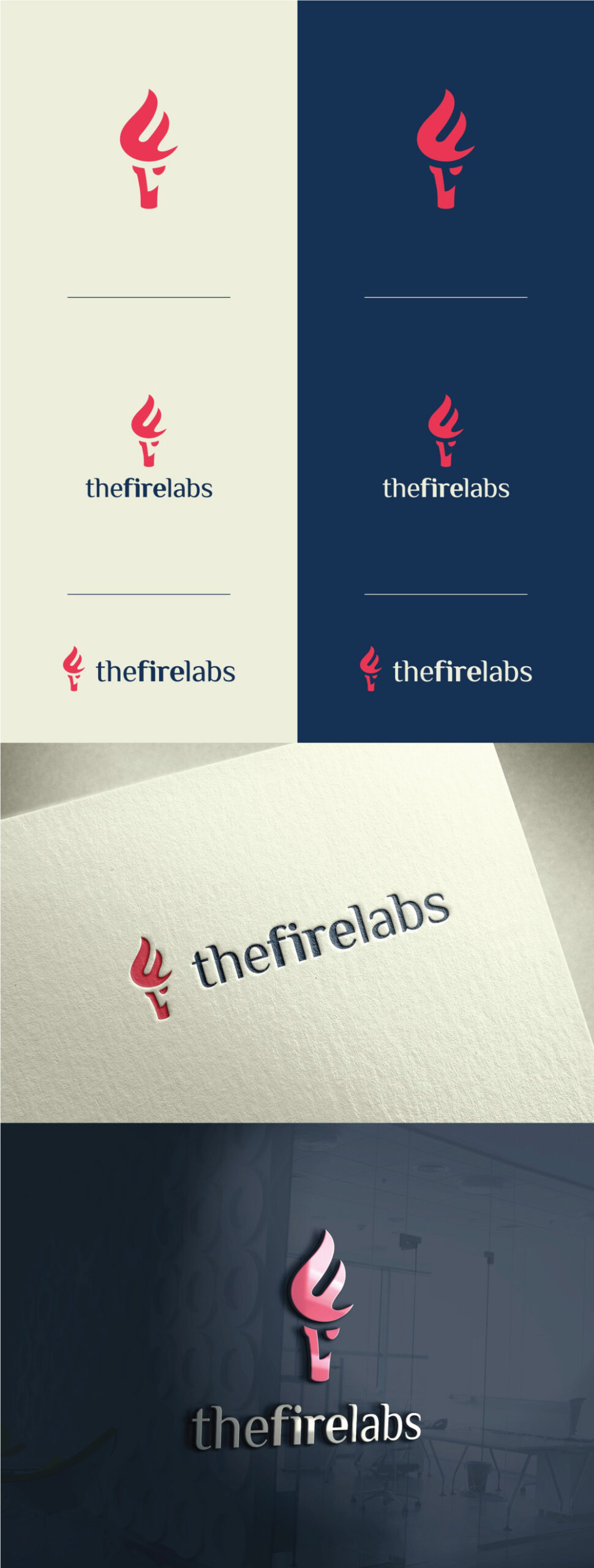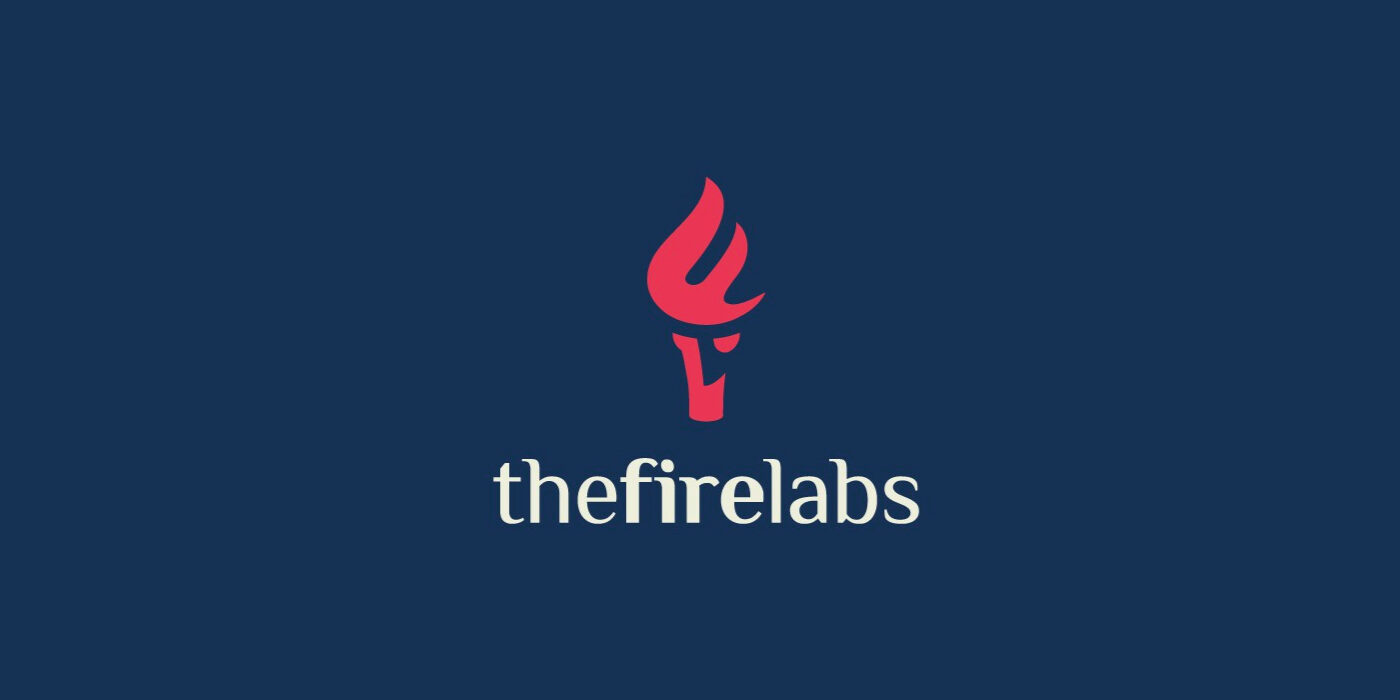
The logo concept is an elegant and clean logo mark inspired by a torch with a flame in the form of letters F and L.
The vertical evolving shape of the logo mark develops a feel of growth around the brand.
The torch announces the illumination of the road and symbolizes enlightenment and hope, and gives a vision of education to provide enlightenment to investors.
The curved shapes evokes a elegant feminine feel. The colors are modern with a feminine touch on red color. The deep, a bit navy communicates trust and reliability.
I paired the logo mark with authentic and sophisticated typography with a feminine touch. The font’s lines endings perfectly fits the shape of the logo mark and also gives a sense of growth.