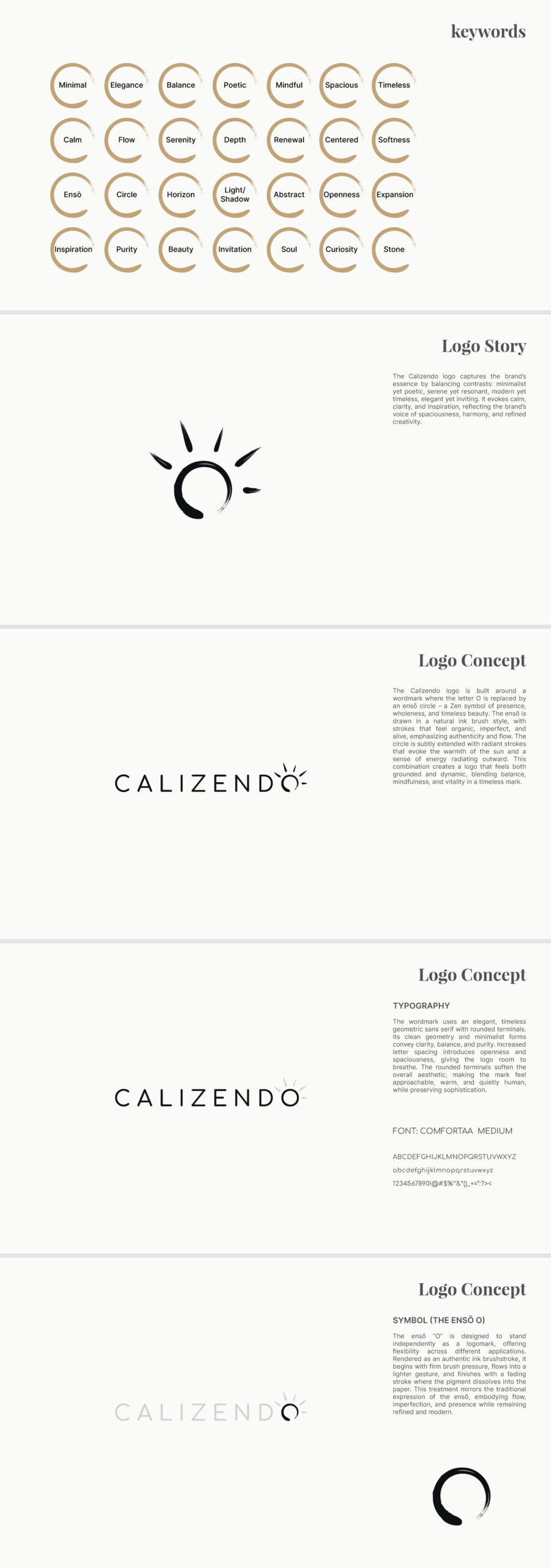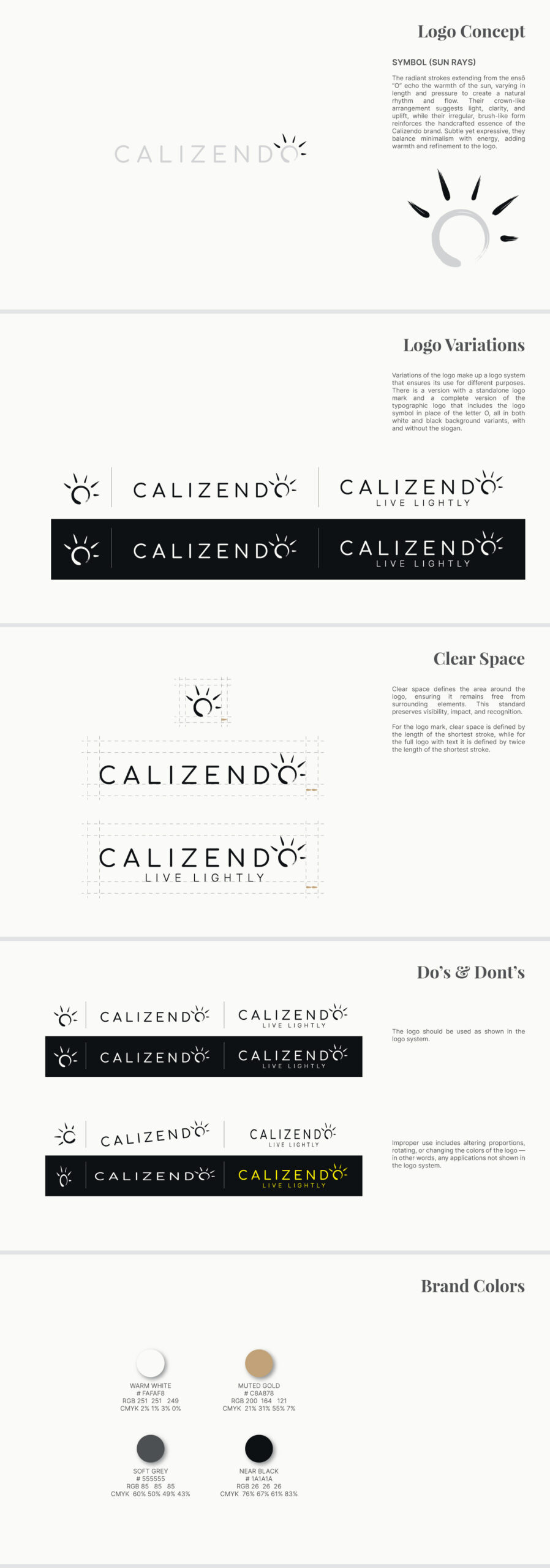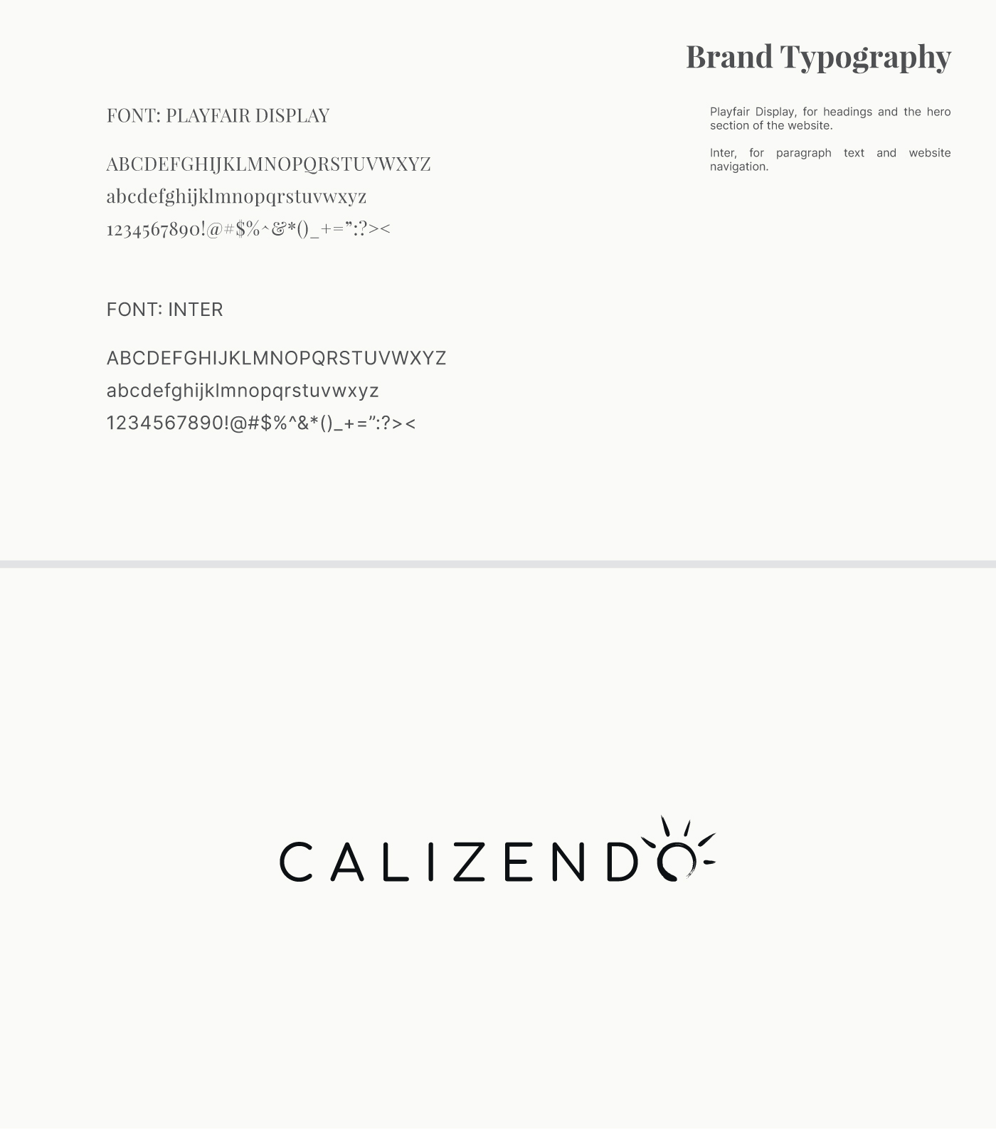
Designed for a California-based creative brand and publishing house, the Calizendo logo embodies calm, clarity, and refined creativity. A minimalist wordmark pairs with an ensō-inspired “O,” drawn in organic ink strokes that evoke presence, flow, and authenticity. Radiant brushstrokes suggest warmth and energy, while the geometric sans serif conveys balance, openness, and timeless elegance. The mark is both serene and dynamic, offering versatility as a standalone symbol or full wordmark across print, digital, and spatial applications.