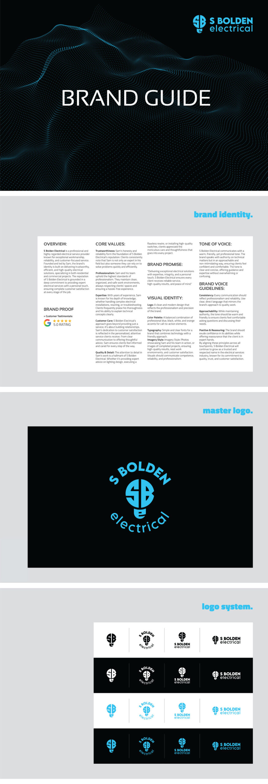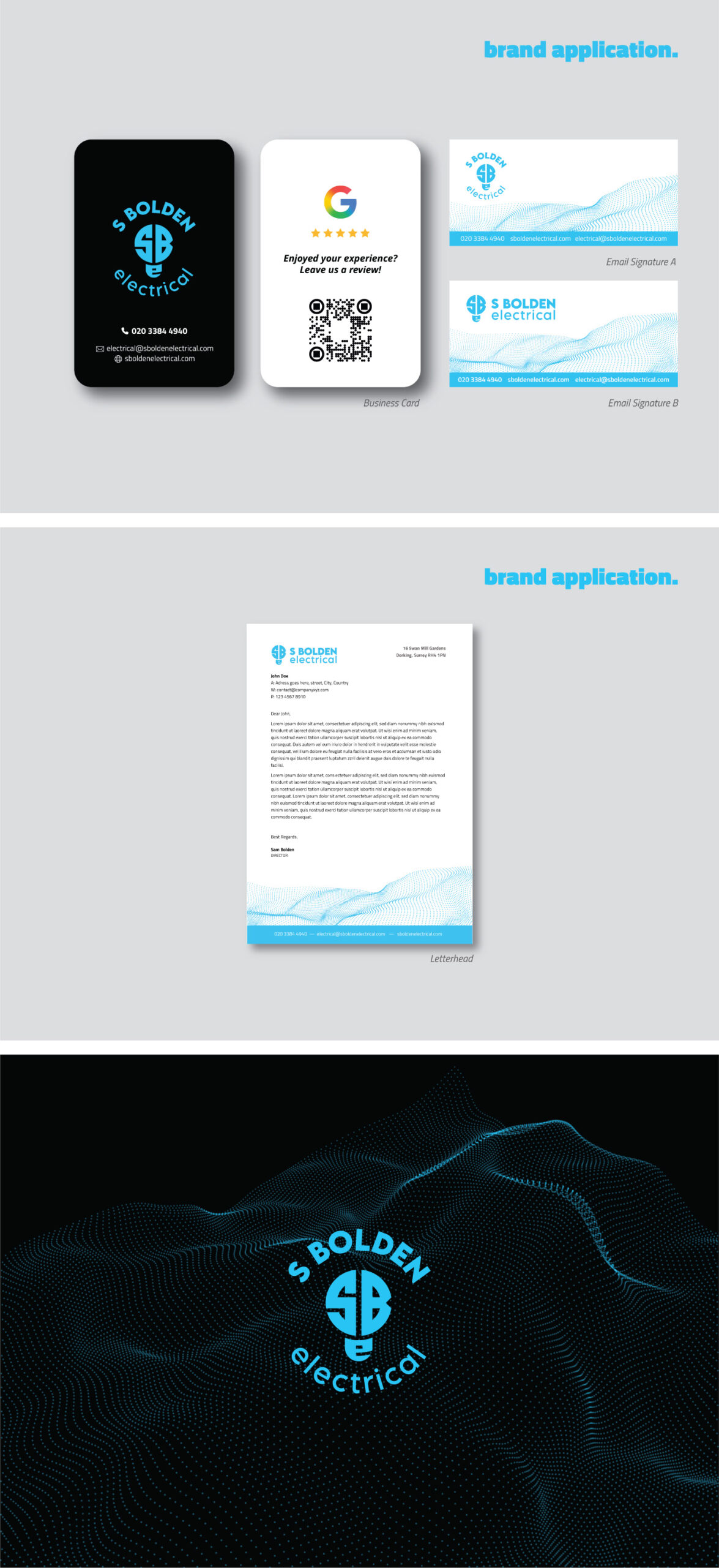
S Bolden Electrical is a trusted electrical service provider known for reliability, expertise, and exceptional workmanship in both residential and commercial projects. The brand identity was designed to reflect Sam’s professional yet approachable service style, emphasizing trust, clarity, and technical precision.
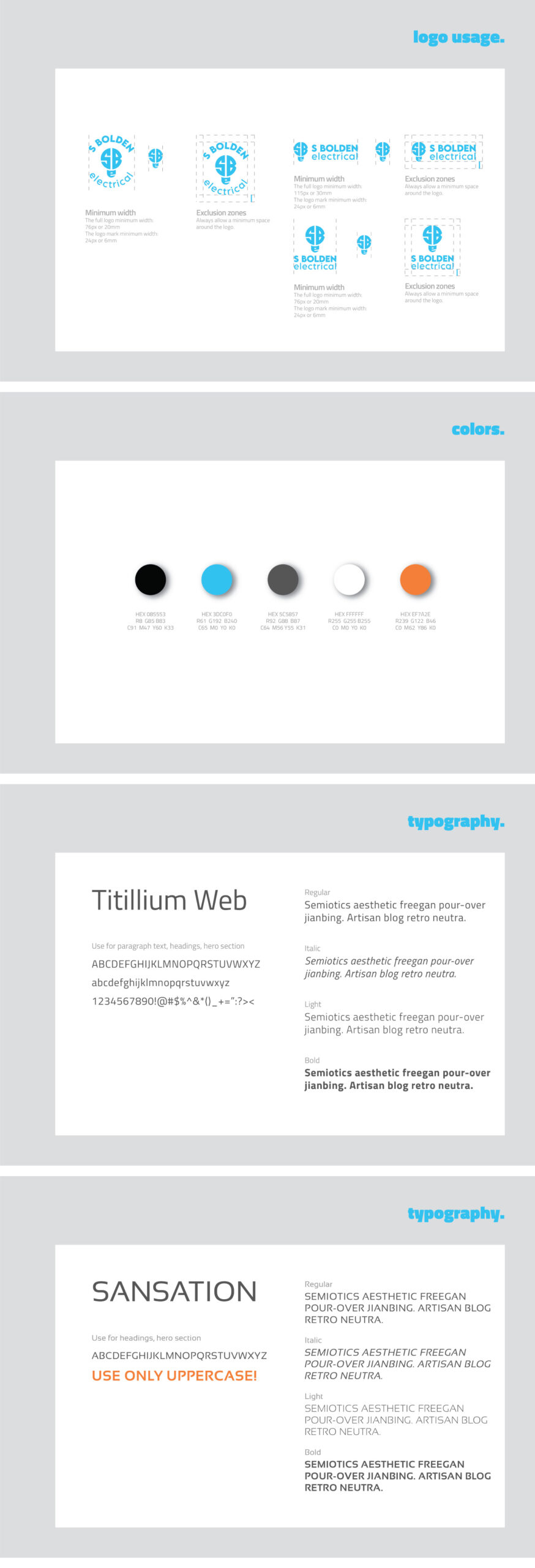
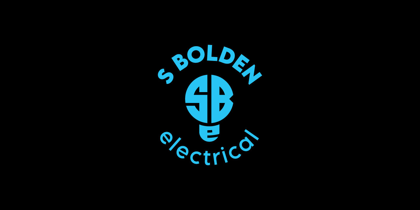
The logo concept is built from the initials SBE, arranged into the geometric shape of a light bulb, a clear symbol of the electrical industry and smart problem-solving. The form is clean and modern, communicating professionalism, efficiency, and balance.
The light blue and black color palette reinforces the brand message: light blue represents technology, safety, and modern solutions, while black adds strength, authority, and professionalism. Combined with sharp, contemporary typography, the identity creates a confident and trustworthy visual system that reflects the quality and care behind every project.
The result is a modern and memorable brand identity that positions S Bolden Electrical as a dependable expert delivering high-quality electrical solutions with a personal touch.